 I'm trying to get away from my comfort zone colors (purple and green), so I went with a yellowish skin tone and lots of warm-spectrum colors, with turquoise for contrast.
Okay, so a little purple snuck in there. Shhhh.
Also wanted to minimize my metalics use. I'm very comfortable with silver and gold metal (not GOOD at them, per se, but comfortable!), so I turned the edgings on the bustier into sturdy brown leather. The only part I'm really unhappy with is the leather of the arm guards. I may need to revisit them.
ALSO, pretty darn pleased with the base. My first real adventures with cork. I went for a swamp scene, with a little dead tree in the back for flavor. Regular super glue over paint for the water.
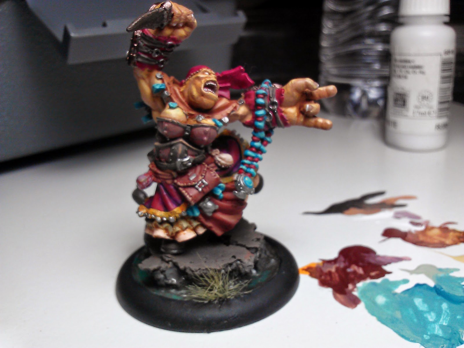

Nice color choices. The colors do a nice job complementing the flow of the sculpt, IMO. I like how you managed to give enough contrast between the skin and the bustier, in order to distinguish one from the other, colorwise. You might consider cheating the zenithal highlighting of the face -- brighten the color a little more from the front, to further distinguish the head from the rest of the piece and force attention to it, especially amidst the competition that the colors and flow force upon the eye. For areas that you wish to diminish, you create contrast in two ways: value and/or saturation. This piece lends itself towards experimenting with either or both. Either darken the deep recesses with a shade, or desaturate them by mixing in the complementary color. Just food for thought, though. It looks great!
ReplyDeleteThanks for the critique! I've never considered how to use saturation for painting. By the way you described it, I'd be adding the complement to sort of gray the color down? I'll have to give it a try. I started the skin after watching this video about color theory (https://www.youtube.com/watch?v=WYZWDEmLR90) and wanted to toy with his suggestion that to lighten a color, you add the next "higher" color on the chart as well as white.
DeleteYup, you got it. Desaturating drives colors towards either grey or brown. The contrasts are often more interesting than just adding black, but that certainly has its place. You can also do the opposite shift in hue -- go in the other direction on the color wheel to shade than the direction you would go to highlight. Experiment with combining any of the techniques and season to taste!
Delete